Problem Background
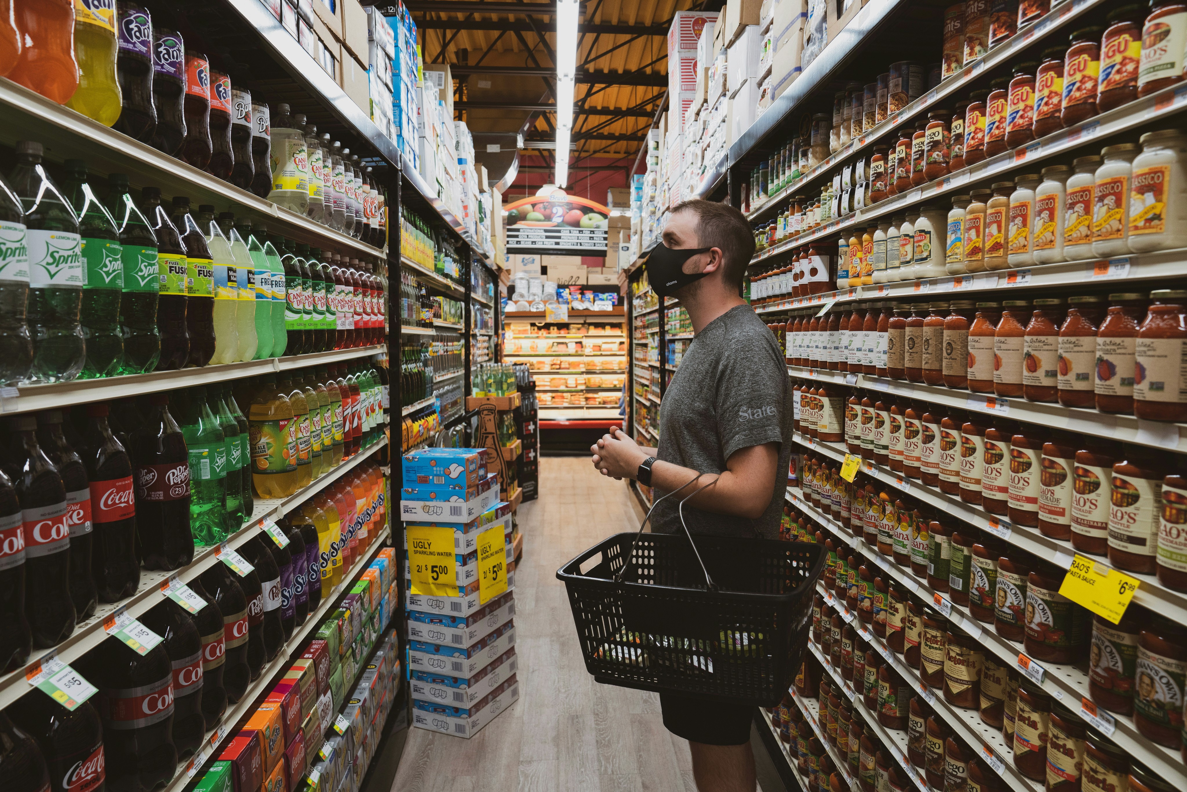
The frustrations of visiting a store designed to expose customers to the most inventory as possible and causing them to actively search for desired items are compounded further for customers with dietary restrictions. This complicates the already complicated process of shopping for groceries, as customers with dietary restrictions must be significantly more conscientious about their selection of items.
The Challenge
The design prompt imposed certain limitations which the way we approached the problem. The key constraints were the following:
The grocery store layout cannot be altered
You can not reorganize things to get people to spend less time at the store
The focus of the design has to be centered on the in-person grocery shopping experience, NOT for curb pickup or online shopping.
Timeline
3 weeks (Oct 2022)
Team
UX Designer: Abdul Moeed Asad
UX Researcher: Maham Ghazanfar (Me)
UX Writer and Documentation: David Stucker
UX Methods Used
Research
Design
Ideation
Sketching
Low-fi Prototyping
My Role
I led the grocery store observations, conducted contextual inquiries in the grocery stores, and created the user journey map and task flow diagrams. Additionally, I played a role in making the sketches and brainstorming, making the protocols for the user evaluations, and conducting them.
Project Objective
The objective of the project was to refine the grocery-shopping experience for customers with religious or lifestyle-oriented dietary restrictions, incorporating technology in a way to make the shopping experience less complex by facilitating the easy generation of grocery lists of appropriate items and allowing them to explore their available options in-store using technology.
Who?
The target user group was of shoppers with specific dietary restrictions based on cultural, religious, or philosophical reasons. We chose not to focus on shoppers with food allergies or sensitivities, due to the time constraints of the project.
What?
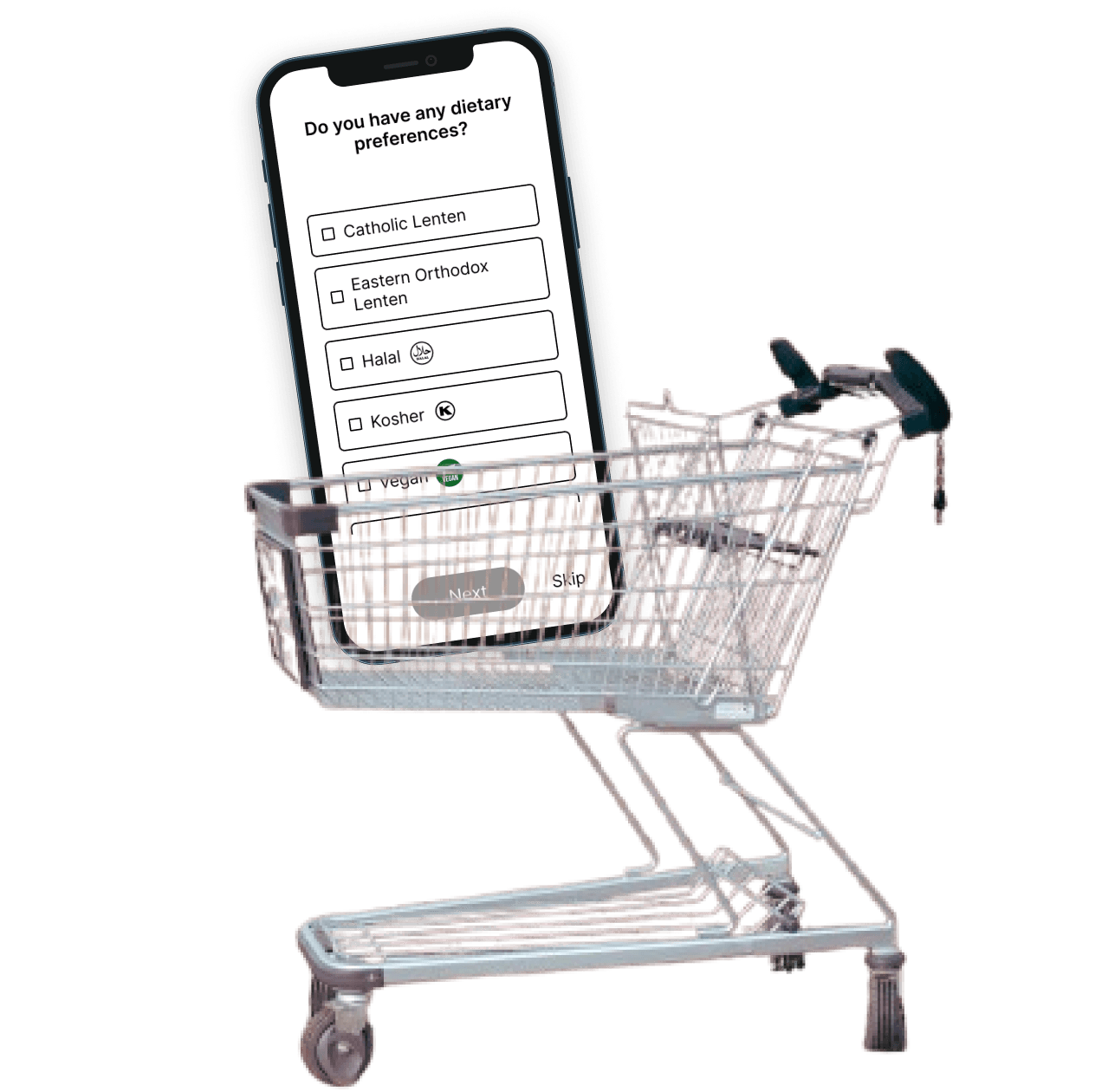
A integration in grocery-store apps that enables people to set their dietary restrictions, enable making lists, get instant feedback upon scanning items in-store for whether an item is restriction-compliant and if not, alternate options available in the store.
Where?
The app features are primarily meant to be used in-person at the store in the store mode that many grocery stores already have. However, some features like the list creation can be done beyond the store too.
Why?
To improve the in-person grocery shopping experience of people with dietary restrictions since they have to spend much longer in stores trying to find suitable items, and checking ingredient labels of items to ensure they can be consumed.
The Solution
Process Overview
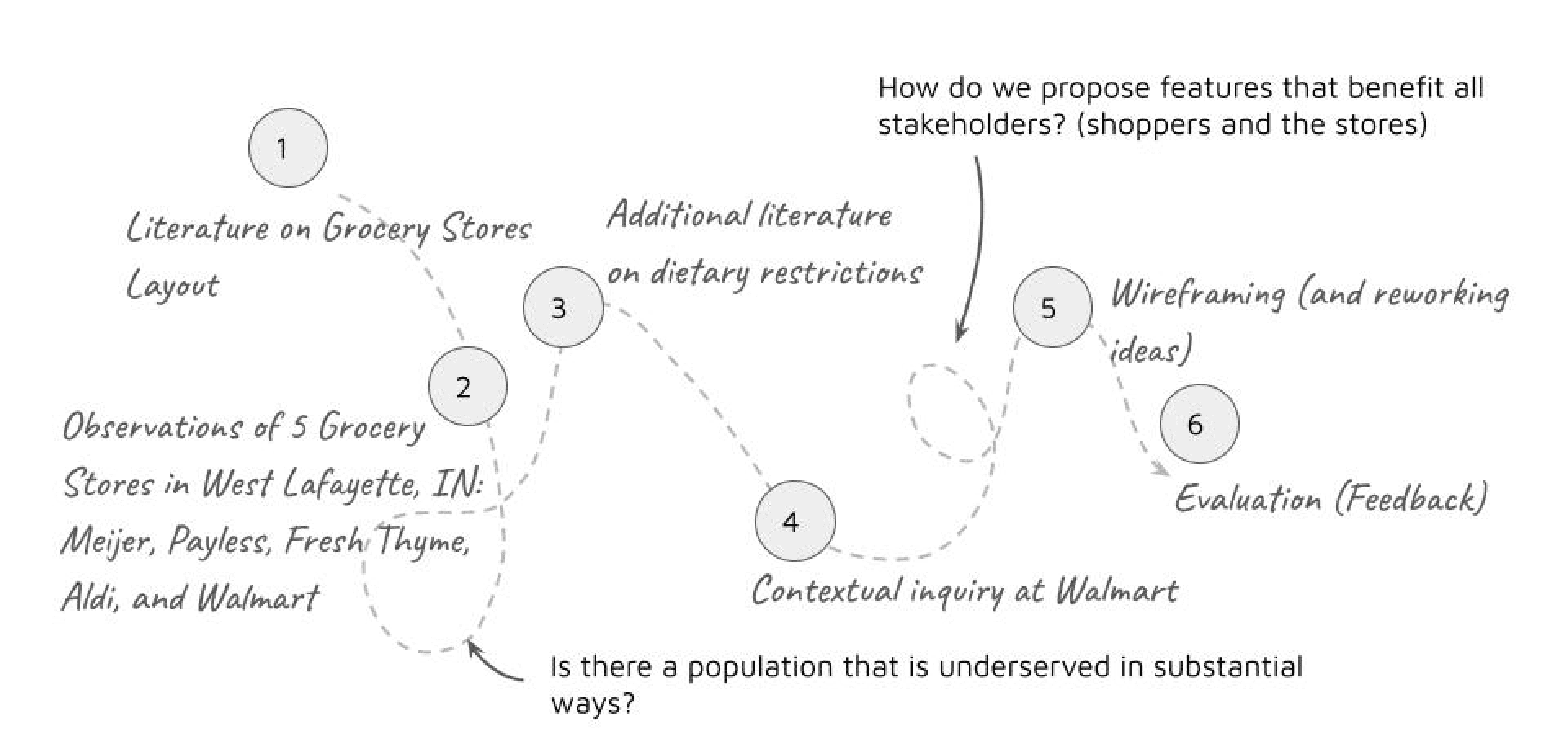
The way we approached this problem was not in a linear fashion and it required us to iterate over different facets of our discovery and design stages and a small overview of it is depicted below.
Understanding the Problem
Initial Research
We began with anecdotal discussions regarding the team’s experience in different kinds of grocery stores and then looked at recent literature and videos on grocery store layout and why it is organized the way it is, how different elements such as lighting, sounds and fragrances play into action. We also considered shopping patterns between in-store, pickup and online groceries and why people chose each. This research helped understand in-person grocery store shopping
Observations
We then conducted observations of in 5 different grocery stores in the West Lafayette region of varying sizes observing the atmosphere of the store, the layout, the use of checkout and self-service lanes, and customer shopping. We found out the following
FINDING 01
Use of Lists
Almost all users used lists, some on their phones and some using paper
FINDING 02
Collaboration
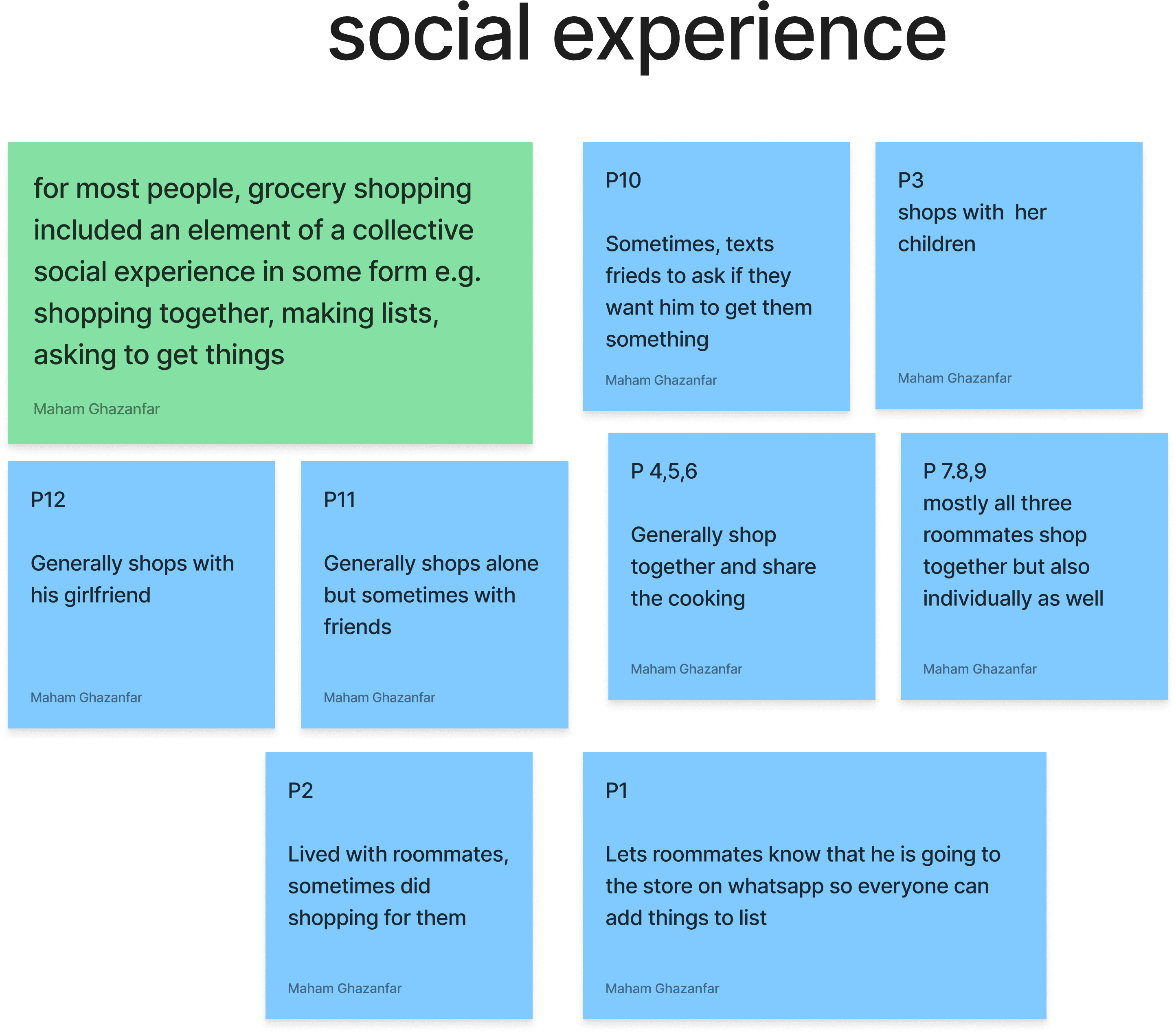
Grocery shopping was a shared experience for most with people either shopping together in groups or many being on videocall or voice call with their friends and family regarding things to buy
FINDING 03
Limitations for Dietary Restrictions
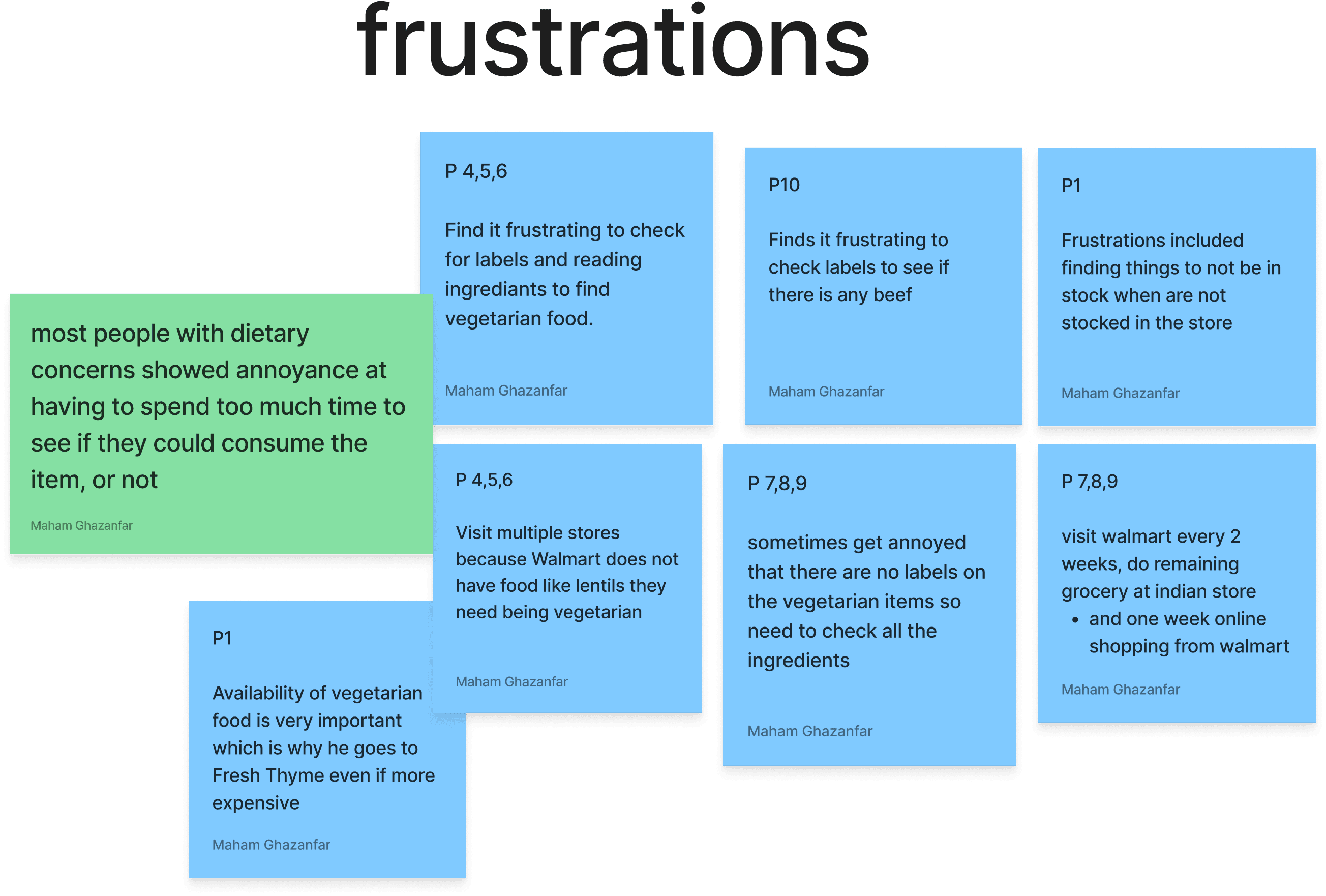
Halal, Kosher, vegetarian and vegan, etc. foods were present in fewer amounts and dispersed throughout the store making them difficult to find
Contextual Inquiry
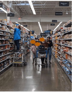
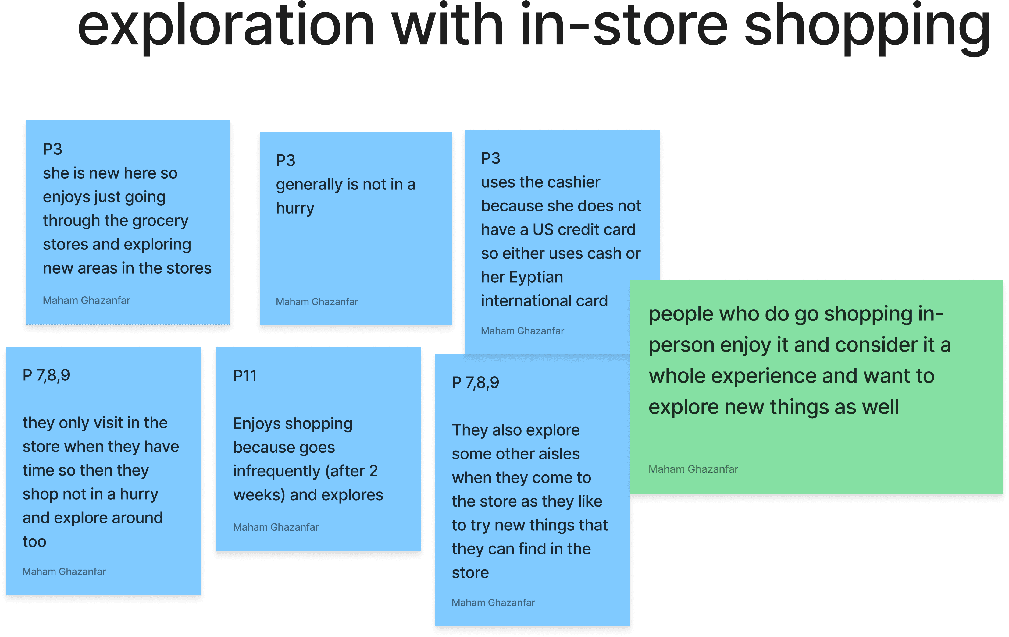
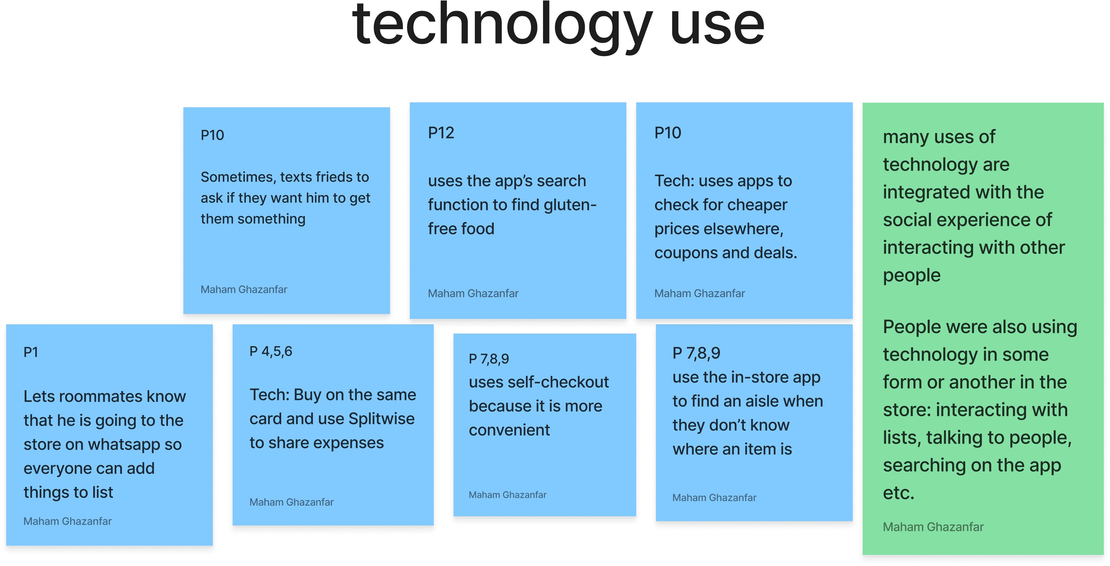
We conducted 12 contextual inquiries in Walmart and Fresh Thyme with users with dietary restrictions mostly vegan, vegetarian and Halal. Most of the users were in their mid 20’s.
The findings of the contextual interviews were then presented as an affinity diagram.
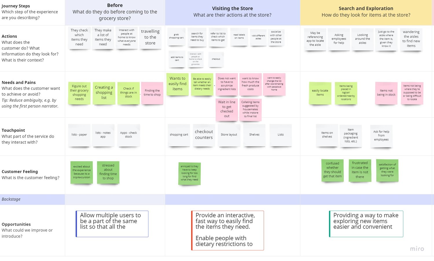
Mapping the User Journey
Based on the primary and secondary research that informed our knowledge, we then mapped the user’s journey to better understand the opportunities and issues in the problem space
Discovery and Decisions
After analyzing the journey map, we were able to identify key opportunity spaces and we made decision to address those needs in the form of features to introduce.
Needs/ Opportunities
Navigating dietary restrictions can be tricky
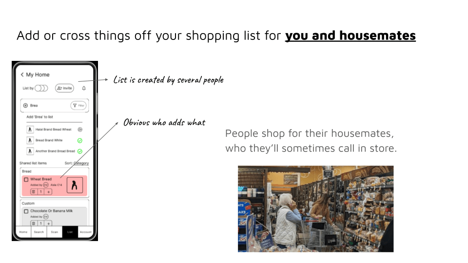
Grocery lists can be socially constructed and are most used artefacts when grocery shopping
Scanning labels of unfamiliar items is taxing and prevents exploration of store
Features
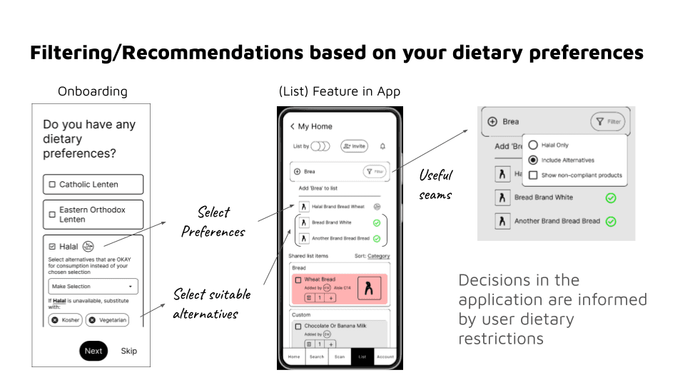
App experience (search & recommendations) centered around dietary restrictions
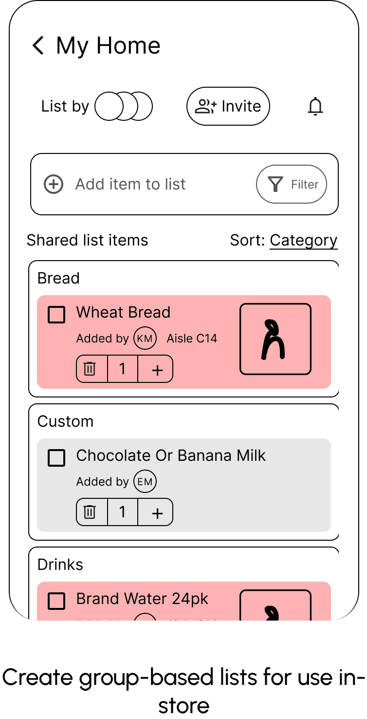
Create better, group based lists for use in-store
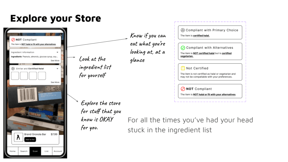
Make scanning easy by surfacing important decisions easy
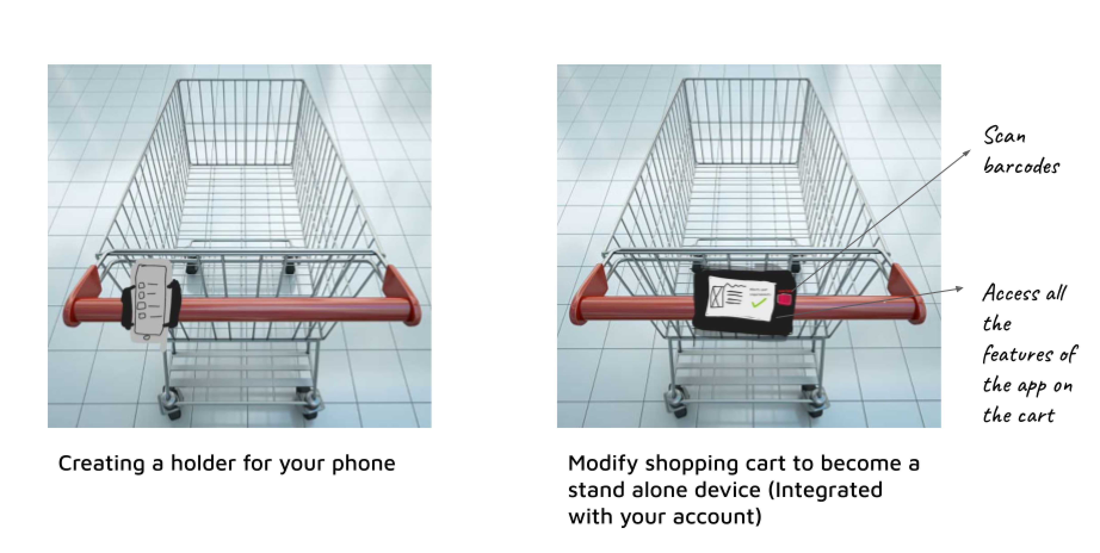
+ service integration ideas with shopping cart to reduce friction of proposed ideas
User Task Flows
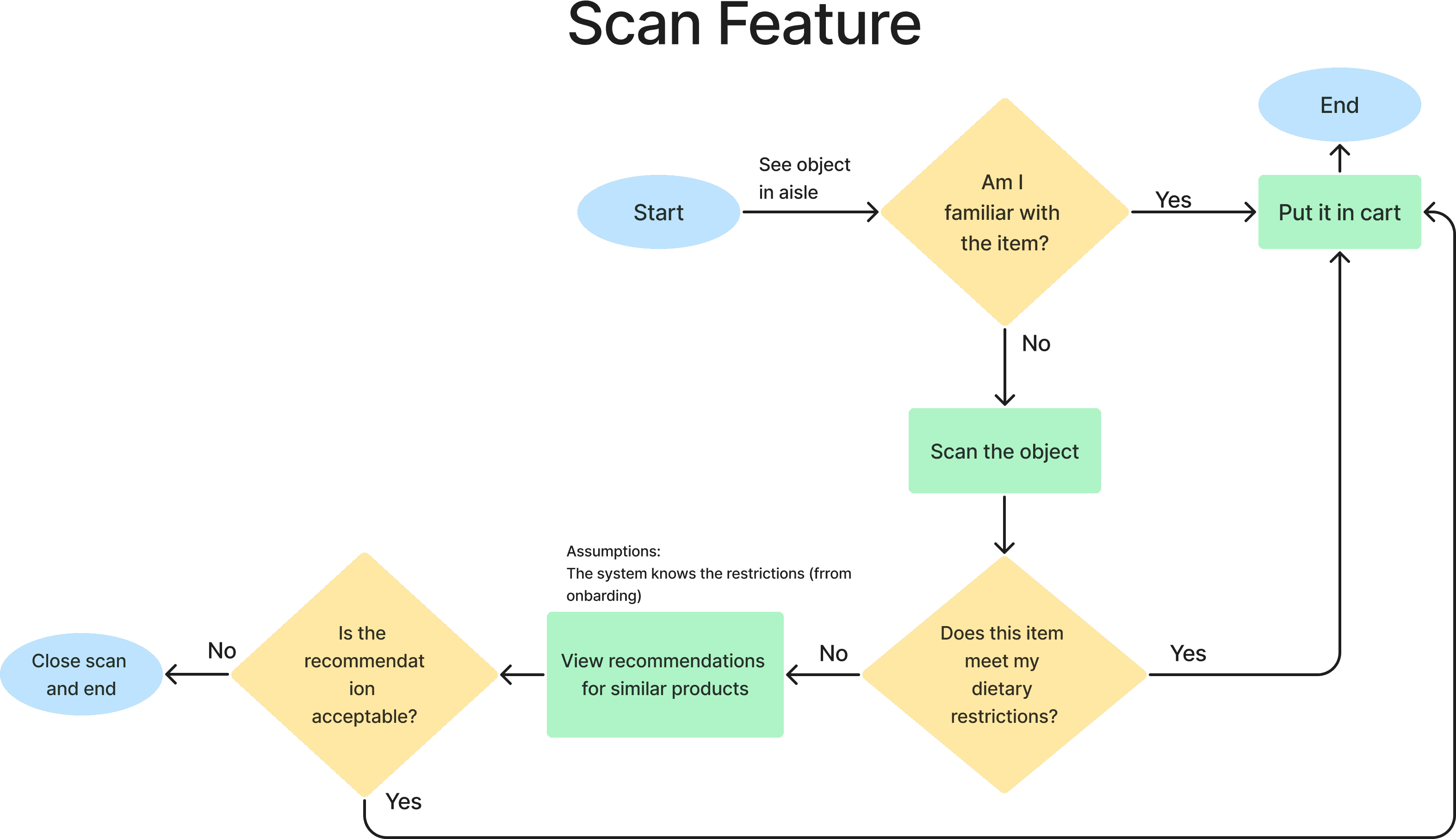
After identifying the core problems and needs of our target users, we began to explore solution development with a brainstorming session in which we considered different design concepts and then voted to pursue our preferred ideas. We decided to define the task flows for the users to define how we would want the users’ experience to be dictated at the grocery store.
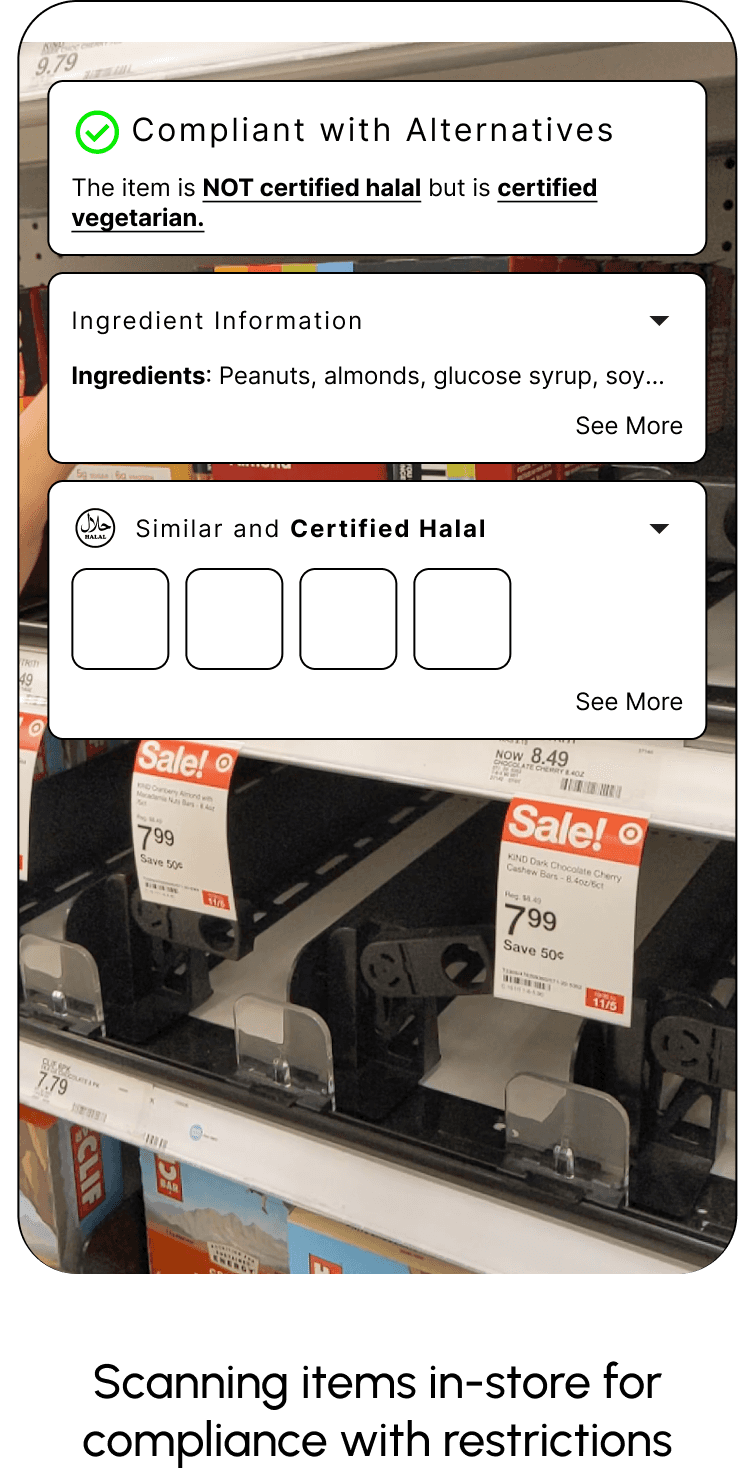
This diagram shows how users would use the scan feature while shopping, particularly in checking unfamiliar items. In the case of a noncompliant item, users would be presented with recommendations of alternate, similar items that comply with their dietary restrictions.
Flow 2: Generating Shared Lists
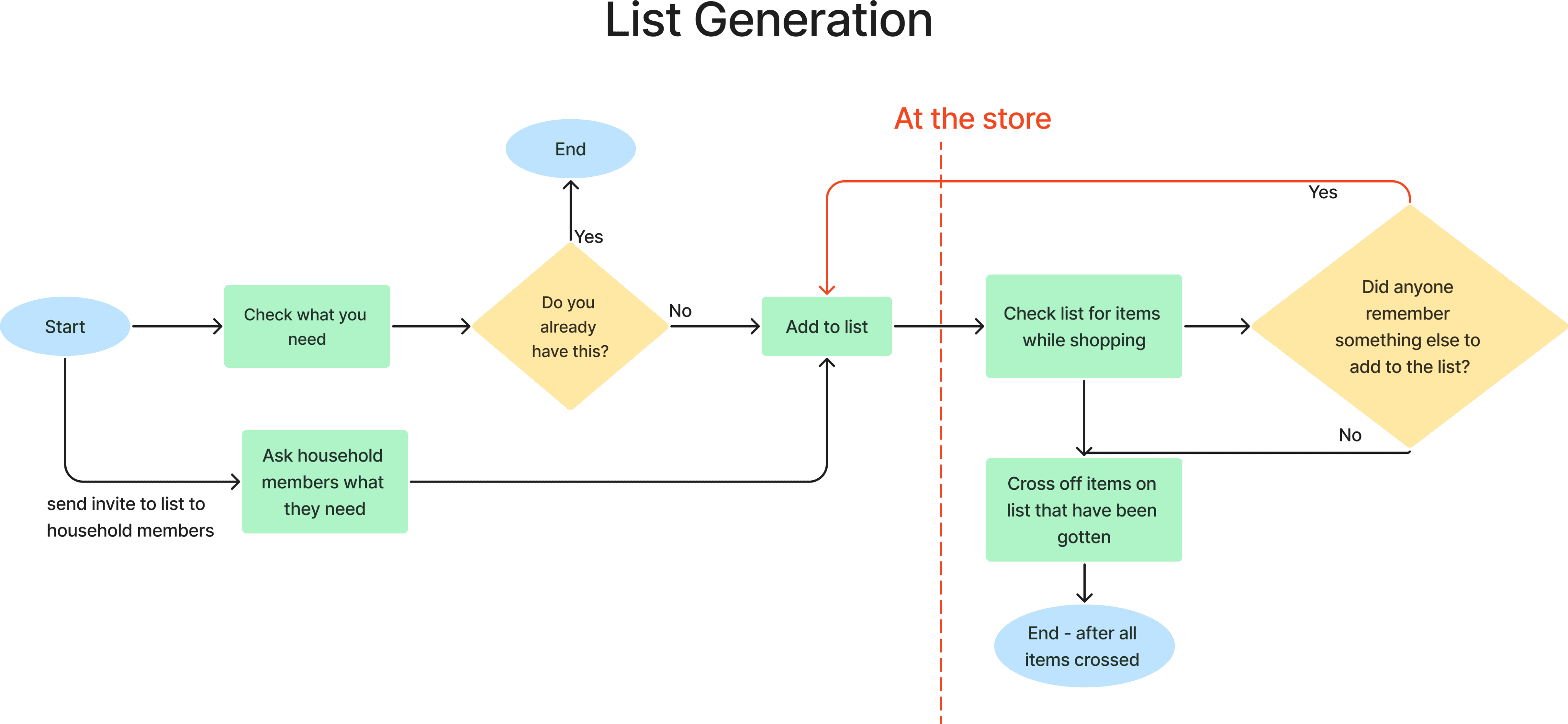
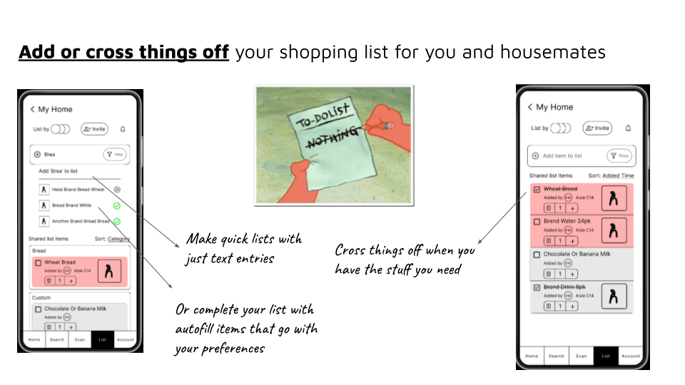
This diagram demonstrates how users go over the process of adding items to their list, how they interact with it in the store itself, and referencing the list and crossing off items from the list once they get the items. Moreover, it also considers how potential members of the user’s household can be involved in the list-making process.
Sketches
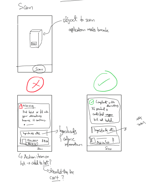
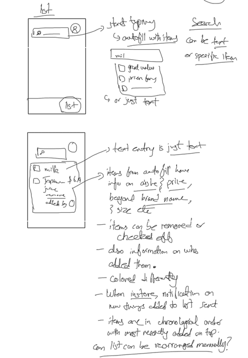
This process was instrumental in exploring different areas and possibilities for the functionalities to see what seemed to work and what did not. It helped to iterate on the designs and refine the idea to make it more concrete.
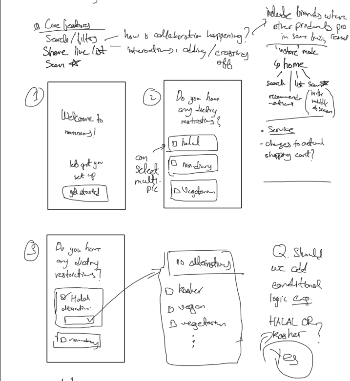
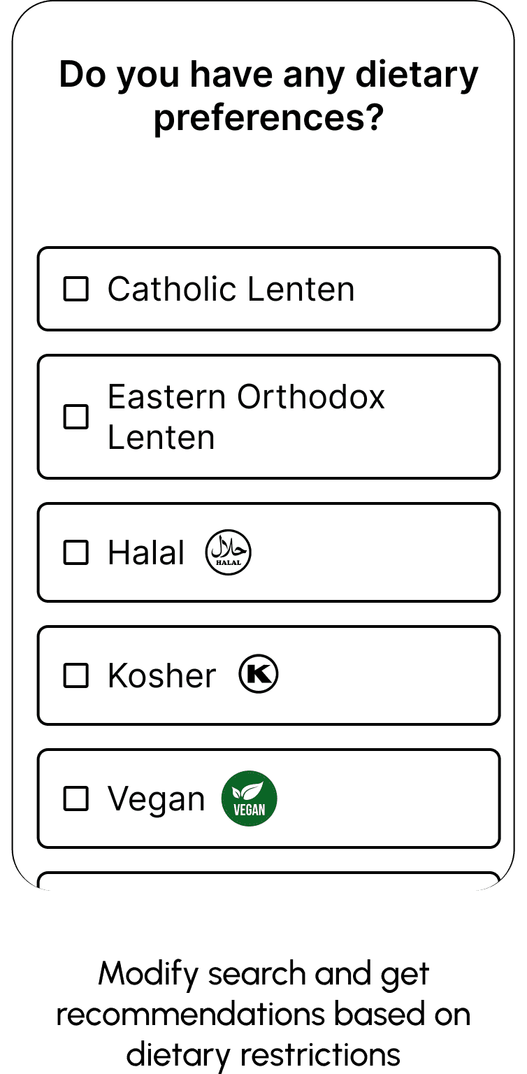
Exploration of onboarding questions and features
Scanning capabilities of the AR-based platform, which demonstrates the difference between noncompliant and compliant items, once scanned
List generation is explored in these sketches, including autofill, capabilities to save past lists, share lists with other people, and display items in chronological or categorical order
Wireframes
For the purpose of example, we used Walmart’s app as the base to show the additional integration to the app. These changes, however, could be implemented on any grocery store app though. Thus, for this project we stuck with mid-fidelity wireframes.
Evaluation
We conducted user evaluations with 3 users one of which (P2) ate Halal food and the other two (P1 & P3) were vegetarians. The evaluations with P1 and P3 were conducted in-store while the one with P2 was online.
Method
The users were given a background of the project and were instructed on how to interact with the Figma prototype and asked to interact with it by performing some user scenarios.
Insights
The interactive digital prototype did not include enough interactions for new users to understand how to use it initially.
All users were easily able to add items to the list.
One user suggested including subtotals based on the users in the shared list as it’s hard to distinguish each person’s total sum.
All users found the scan feature and associated recommendations for similar products to be the most helpful since it is a time-consuming task for them to manually search for ingredients.
The modified cart with the scanner and app integration was unanimously preferred because it allowed them to not have to depend on their phones or be distracted by them, while shopping.
Limitations
1
We did not consider all types of dietary restrictions, particularly food allergies
2
We could not extensively test our ideas with users, especially since the users we tested were in-store so there was limited time to test the ideas. Moreover, the clickable prototype was not entirely clickable since it was mid-fidelity which caused problems initially as people were unsure how to use the prototype.
3
Since this project was conducted in a college town, the findings were closely aligned to behaviors notable in such areas

