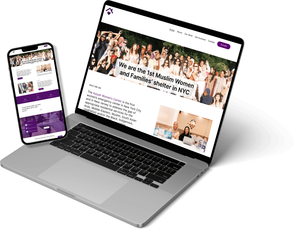
From Clicks to Care: A Website Audit for Asiyah Women's Center
Evaluating and redesigning the non-profit’s website
Jump to Solution
How it all began....
In my role as a UX Design Consultant, I had the incredible opportunity to lead a comprehensive evaluation of the Asiyah Women's Center’s website, a non-profit organization dedicated to providing shelter to victims of domestic violence, and immigrants and refugees in need.
I conducted an in-depth website audit to identify opportunities for improvement and enhance the online experience.
The goal? It wasn’t just about addressing usability challenges; it was about amplifying Asiyah Women's Center’s core mission of empowering vulnerable women and increasing donations through a stronger digital presence. Let’s explore the details of this impactful project together!
Timeline
1 month (September 2024)
Presented To
The Communication Specialist at Asiyah Women’s Center
UX Methods Used
Research
Heuristic Evaluation
Usability testing
Design
Ideation
Sketching
Low-fi Prototyping
Hi-fidelity Prototyping
My Role
I conducted desk research and mapped the research protocol, conducting pilot and semi-structured user interviews. I also work on creating the sketches, prototyping and testing.
Uncovering the gaps and piecing together the solution
The Problem
Asiyah Women’s Center’s website visitors face challenges in understanding the services offered and the impact they make, leading to suboptimal visitor engagement and a lack of donations. Furthermore, the contact form is out of use with no information provided, people seeking the services cannot get the required information, and the careers information is outdated,
How can the website be enhanced to provide a more accessible and engaging platform, ensuring clearer information about their services and impact for help seekers and organizations for grants, and fostering deeper donor engagement to increase donations in support of their mission?
The Solution
1
Enhanced Website Design: Improve visual hierarchy and ease of navigation
2
Clearer Communication: Redefine mission and work they do, use compelling narratives, provide visual information, and concise content.
3
Consistency: Ensure all pages are cohesive, and no missing information
4
Mobile Optimization: Ensure that the website is responsive and easy-to-use on the mobile, especially for help seekers
The Impact
In my volunteer role, the audit I conducted was met with immense satisfaction by Asiyah Women’sCenter on the findings and the design recommendations I provided.
While we don't have exact numbers yet, it's important to emphasize that I am currently working to implement the redesign on their website, and the potential impact is significant.
"Maham came to our first meeting fully prepared, having already highlighted several key issues with our website. As someone with little experience in web design, I was incredibly grateful for her expertise and guidance. She clearly laid out the entire redesign process, keeping me updated with progress and next steps along the way. We had been struggling with our website for a while and weren’t using it much, but Maham's work gave us the direction we needed to fix it. Thanks to her hard work, we now have a plan in place to engage with our community more effectively and increase donations. I’m so thankful for her dedication and skills, and I’m grateful for her expertise and commitment to our cause!"
— Ratha, Asiyah Women’s Center, Supervisor and Communciations Manager
Research Methodologies
Before embarking on redesigning the website, I drafted a research plan to organize the audit process. The research methodologies I used were:
Stakeholder Interview
I started by having an in-depth conversation with a key team member. This was an essential step to ensure my research goals aligned with the organization's vision and needs. Gaining their insights allowed me to shape my objectives to be more relevant and valuable to AWC and to understand which new features they wanted to introduce to the website.
Heuristic Analysis
Conducting a heuristic analysis enabled me to identify all the issues the website had in a systematic manner, using the usability principles as my guideline.
User Testing
Conducting user testing with actual visitors enabled me to understand the way users navigate through the website, and highlight the key usability issues they face. This enabled me to prioritize the changes that were essential which hindered the user’s experience.
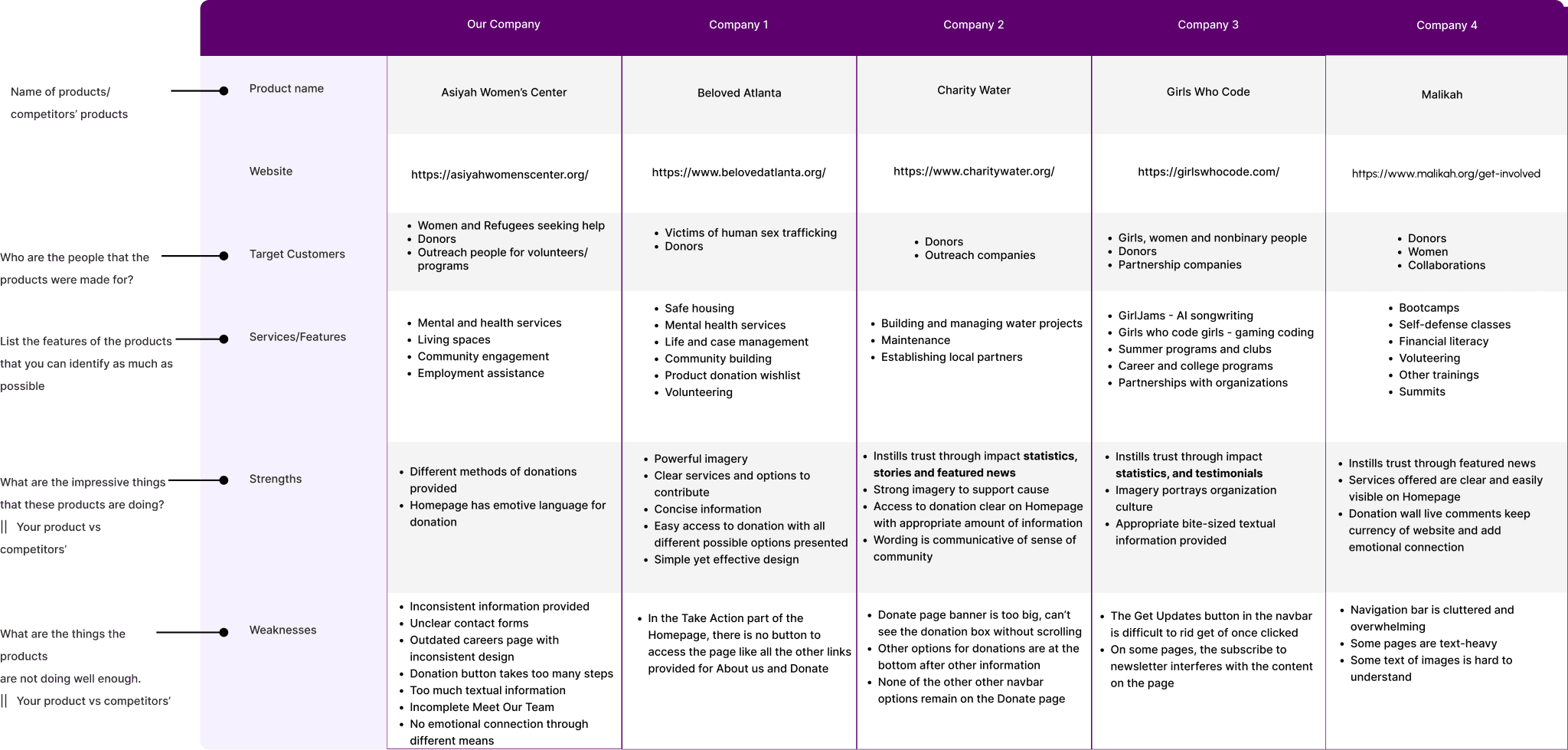
Competitor Analysis
I researched successful non-profits to gather key insights. This analysis helped me understand the best practices and strategies employed by other organizations. By recognizing effective trends and approaches, I was able to adapt and apply them to enhance Asiyah Women's Center’s operations and outreach efforts.
Wireframe and Hi-fidelity Wireframes
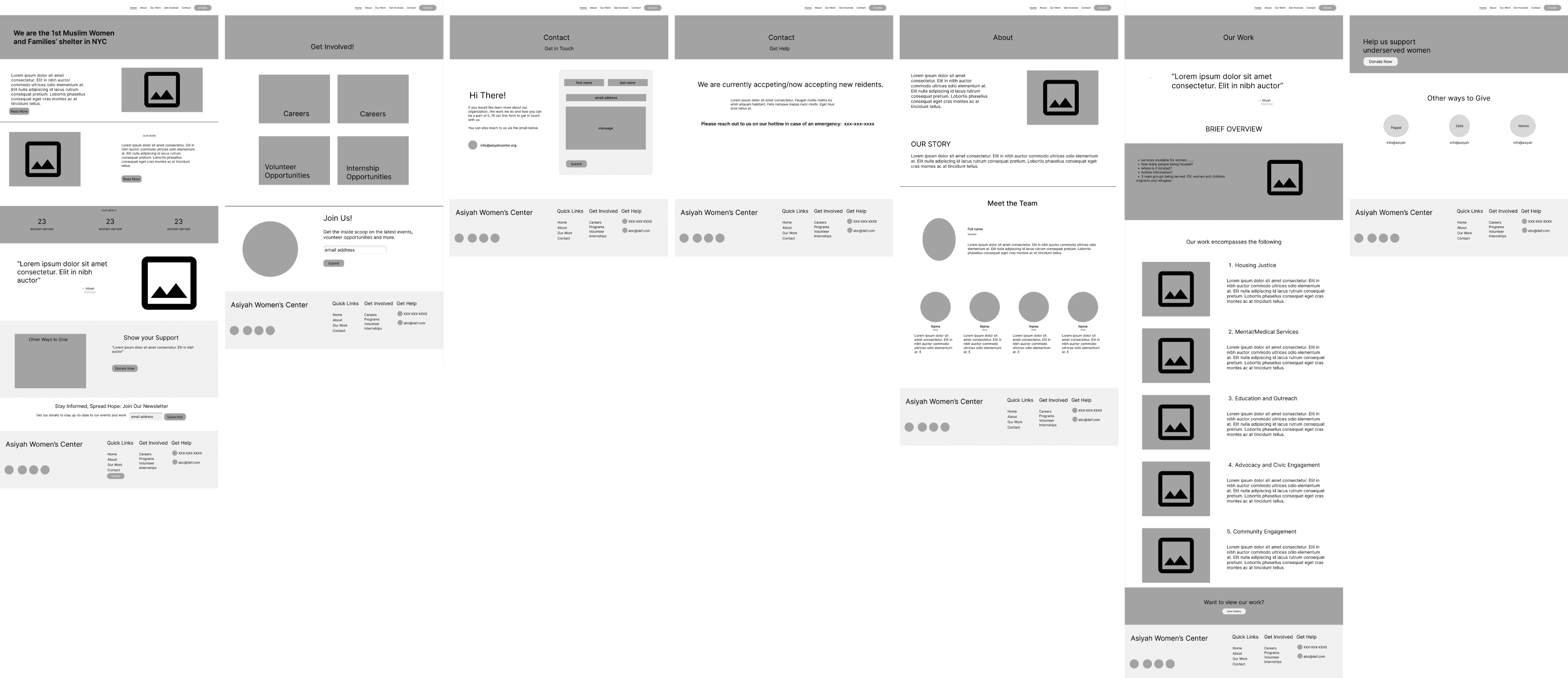
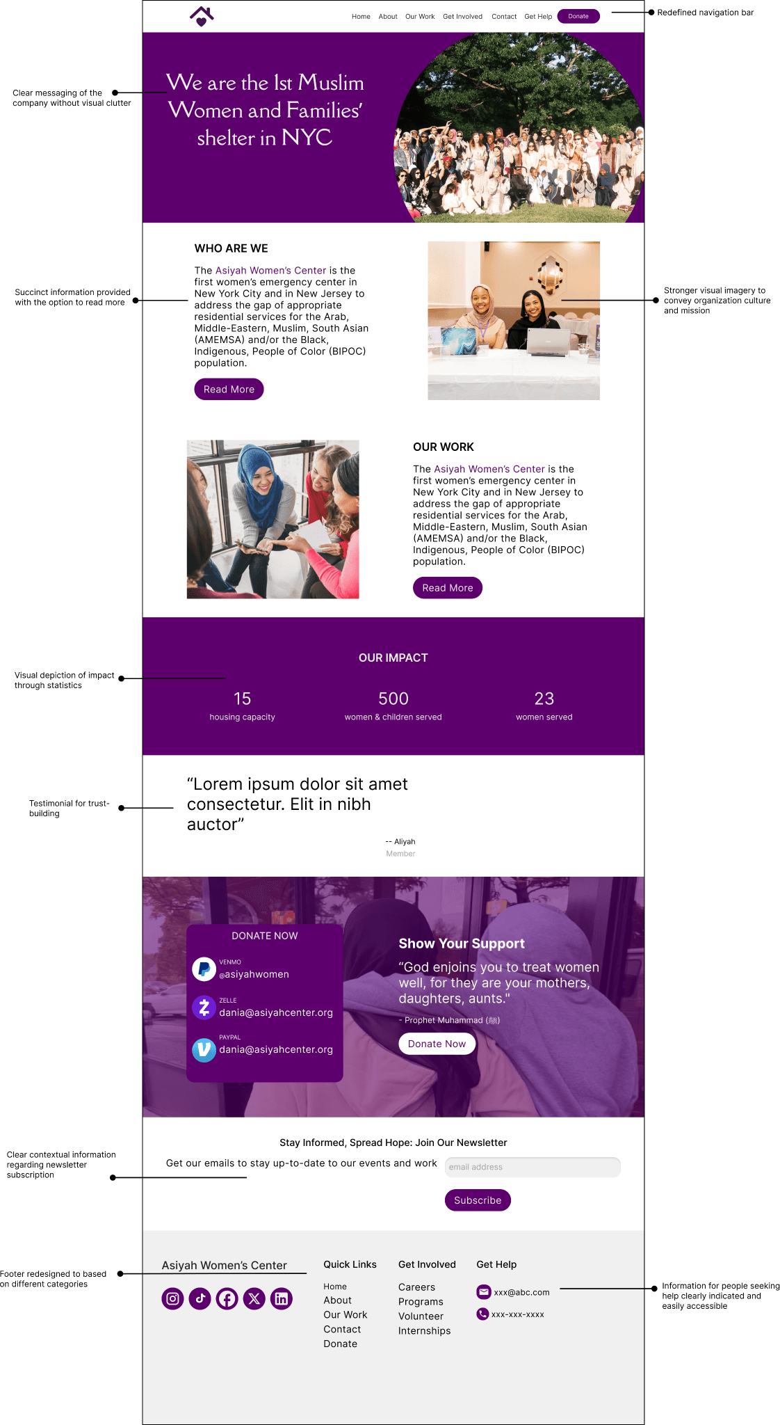
I created wireframes to show the restructured layouts and content to cater to providing information in a more visual manner, and using emotive language and clearer CTAs. Following feedback, I created the hi-fidelity designs to show how the redesigned website would look and function.
Website Redesign
Currently, I’m implementing the design changes. Since, they need the website functioning, I’ve divided the design process into several prints, adopting an MVP approach to the website redesign, having the essential features added first, followed by the additional requested features.
Stakeholder Interview
I started the audit process with a semi-structured interview with Ratha, my point of contact at Asiyah Women’s Center. The interview was conducted on Zoom for about 35 minutes that focused on the business objectives of the website, target audience and the types of interactions, website functionality and desired enhancements. The interview provided me a comprehensive understanding of what were the areas to focus on helped set expectations for the desired outcome.
Key Insights
INSIGHT 01
Inaccessible Contact Forms
The contact forms across the pages were inconsistent and it was unclear whether the contact form was for everyday visitors seeking general information or for people seeking help services to contact the organization.
Moreover, the helpline phone was only available on the mobile version and nowhere on the desktop version.
INSIGHT 02
User Groups NOT Targeted
I was made aware that the organization expected several different types of users based on the type of activity. for example, Donors and Government agencies needed to be able to view the work they do clearly and effectively to get donations and grants, the help seekers needed to be able to contact the organization, and the organization wanted to recruit people for their outreach programs and volunteer opportunities but of all these, only the donation button was present and repeated information about the work they do. Currently, the outreach and help services were mostly being accessed through their Instagram.
INSIGHT 03
Messaging
Currently, the website simply provides random pieces of information in different areas but does not appeal to the user and does not create an emotional connection. Furthermore, the website only mentions 1 of the 3 groups the organization serves: victims of domestic violence when in fact, they also serve women and children in need, and refugees and migrants.
Heuristic Analysis
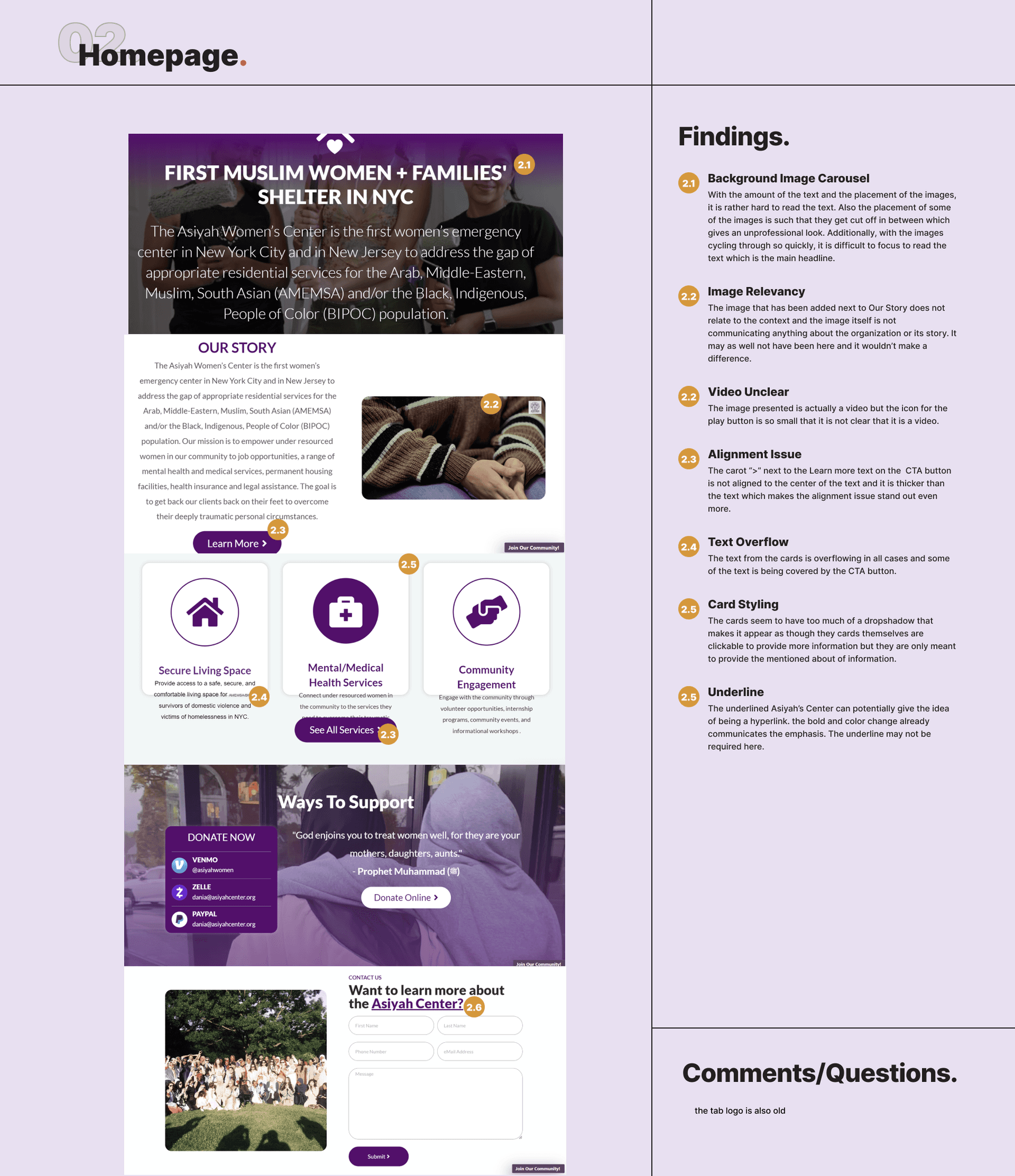
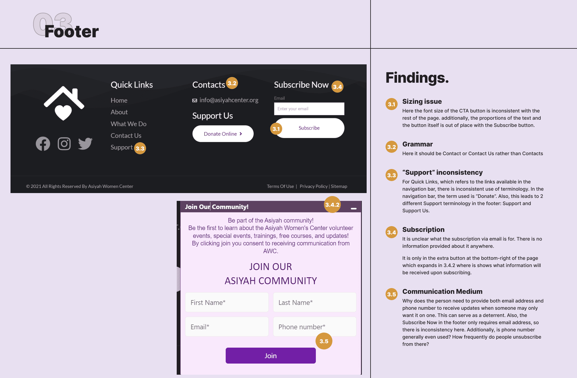
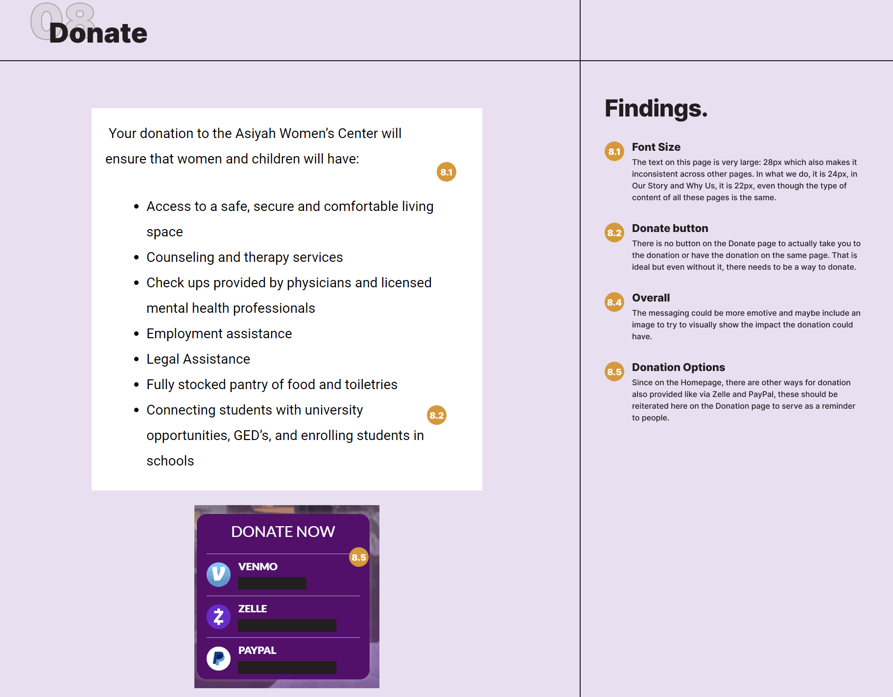
The heuristic analysis was conducted with a clear goal: to ensure that the various target user groups could easily access essential features and ultimately increase donations. I carefully evaluated each page and interaction across the website, identifying issues with navigation, usability, and overall user flow to uncover areas for improvement that would streamline the user experience.
A peek of some Issues
The Small Edits
After conducting the audit, it became clear that there were some very important issues in the website that required immediate action. Moreover, the organization had an upcoming event for which they wanted these issues to be fixed immediately. As a result, I first had to fix these issues before being able to conduct user testing on the website, due to the time constraints and requirement of the organization.
The changes made were:
3
Eliminating the redundancy in the Footer for ‘Support’ and ‘Donation’ and providing contextual information regarding the signup for the newsletter.
4
Create larger cards, and ensure there was no overflowing text, and no missing or sizing inconsistencies on any page.
User Testing
Conducting user testing was essential as it allowed to see how users navigate through the website and the pain points they face while using it. I conducted the testing with 3 users, having them perform different tasks, following it up with a post-completion questionnaire.
Insights
Content Overload: Users found the site text-heavy, with long paragraphs making it hard to find key information quickly.
Contact Form Issues: Many users couldn't submit the contact form due to unclear instructions or field errors, making it difficult for those seeking help.
Complex Donation Process: The donation flow had too many steps, frustrating users and discouraging them from completing the process.
Help Resources Lacking: People looking for assistance couldn’t easily find helpful information, leaving them confused about how to access support.
Lack of Trust in Donations: Pages beyond the homepage felt incomplete, and without success stories or clear metrics, users were hesitant to donate.
Inconsistent Visual Appeal: While the homepage was engaging, the rest of the site felt rushed and less polished, hurting user interest.
“I liked the homepage, but the rest felt unfinished. The donation page was confusing, and I wasn’t sure where my money would go—there weren’t any examples of the center’s work."
Competitor Analysis
Checking out the Competition
To gain a better understanding of how to enhance AWC’s website for engagement and donations, I decided to do a deep dive into 4 other non-profit organization’s websites. 2 of these were closely aligned in their mission as well, serving women victims of different abuses, while the other 2 were also non-profit organizations. These organizations were chosen since they address community engagement through various means, focus on gaining donations and provide information about their company while also building trust with the user.
The key areas of analysis that I focused on were the following:
Visual hierarchy
Ease of navigation
Impact through testimonials, statistics and partnerships
Community engagement
Media and visuals
Donor engagement
Events and programs
User experience and functionality
Wireframes
Redesigning the website layout
The purpose of creating the wireframes was to move from abstract ideas for enhancing the website to clear visual layouts. This phase served as an essential link between brainstorming and the final product, offering a concrete foundation for collecting feedback. Since I was proposing major changes to the current structure, the wireframes provided a clear way to visualize the redesigned site, refine it based on input, and make adjustments before advancing to the high-fidelity design stage.
Crafting the Visual Identity
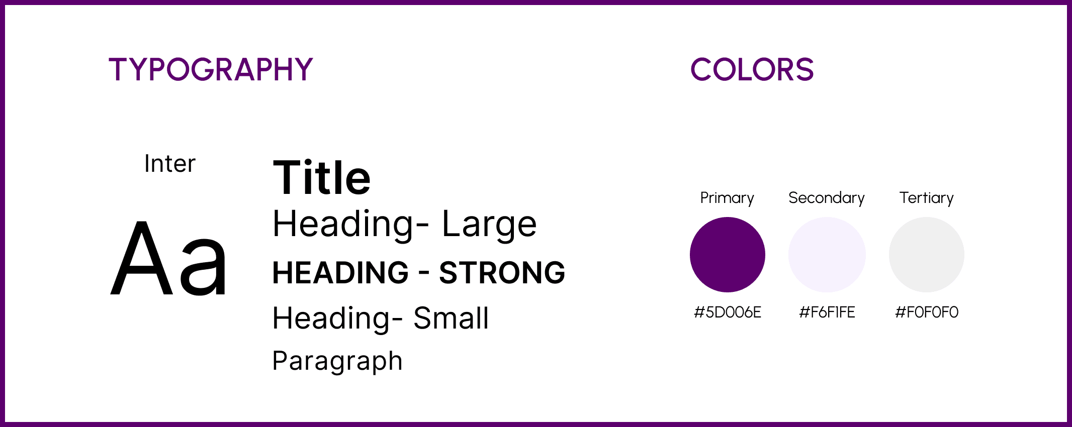
Using some of the organization’s existing branding colors, I defined the style guide for the mockups to maintain consistency in designing the screens, and then implementing them.
Mockups
Using some of the organization’s existing branding colors, I defined the style guide for the mockups to maintain consistency in designing the screens, and then implementing them.
The redesign of the Homepage has been explained in detail here.
Mockup Video
REFLECTION
Moving Forward
The mockups presented here are currently being implemented on Asiyah Women’s Center’s website.
Some minor changes to the design are yet to be made, especially with regard to the content which is dependent on what information the organization wants to add.
I would like to conduct more user testing after the final designs to identify any remaining issues or changes to be made.
There are other features that the organization wants to introduce which I will ideate on and design after the current sprint, once the remodeled website is functional.
REFLECTION
Retrospection
This project differed from my usual UX work, as my client had digital marketing expertise but little website design experience.
I led the project from start to finish, identifying key issues, proposing solutions, and adapting as I went. Each phase boosted my confidence in redesigning complex structures while honing my ability to explain technical concepts clearly.
The experience strengthened my skills in project management, stakeholder communication, and delivering user-centered designs that aligned with the client’s goals.
